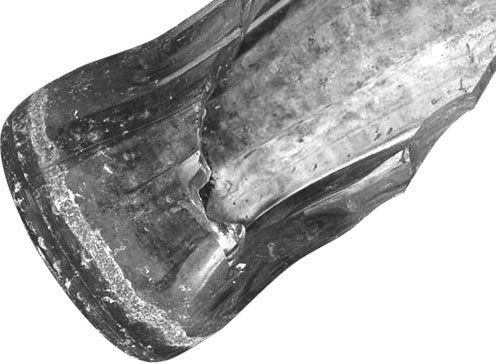
In 1915, a designer at from the Root Glass Company in Indiana was given an assignment: “Design a bottle that is still recognizable when broken into pieces.” Can you identify this bottle?

If you said Coke, you are absolutely right. The designer of this bottle absolutely succeeded in his assignment. In fact, the shape of the Coke bottle has become one of the elements that makes the Coke brand so strong. The shape is so unique and is used so consistently that people can identify the brand without seeing the label.
The Coke bottle example helps illustrate what Martin Lindstrom coined as a “Smashable Brand”in his book, Brand Sense. You know a brand is strong when it can be broken into its parts and still be recognized.
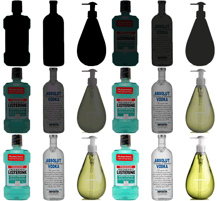
Below are some other brands that also have a smashable shape. Can you identify them by shape alone?


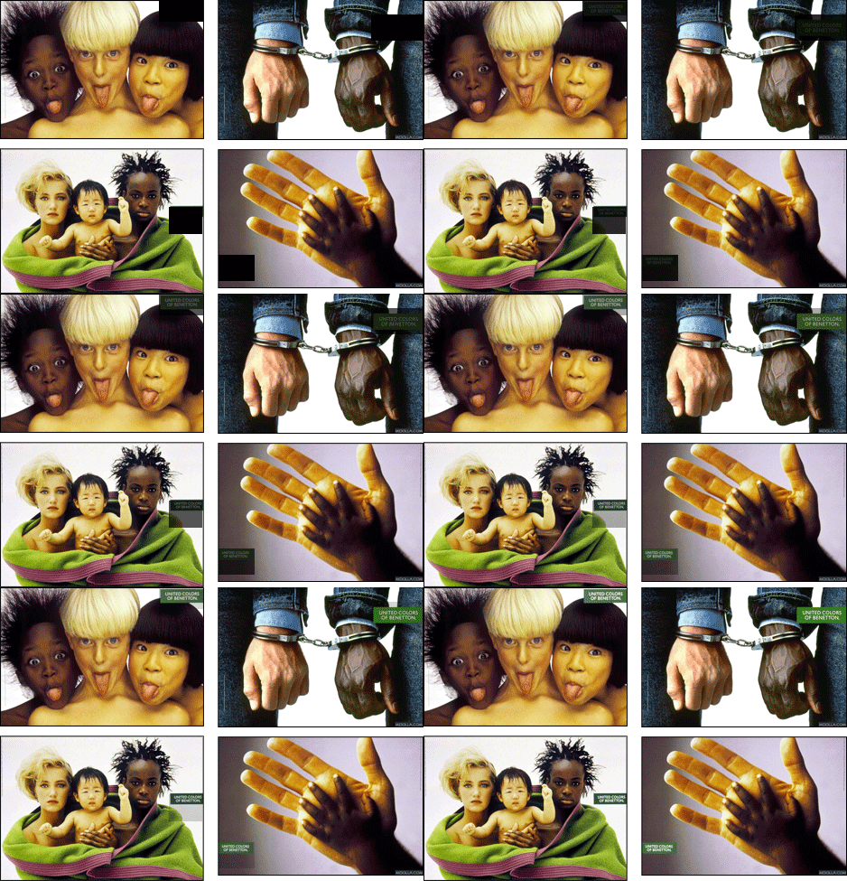
This clothing brand doesn’t even need to show their product. Their fans identify them immediately. The brand’s ideals and personality rings loud and clear in each photo and the color palette/lighting is always very similar too.
(Answer: United Colors of Benetton)

Everything from their building’s awning, to the employee uniforms to the packaging and print ads are dominated by these three colors.
(Answer: Jimmy John’s)
(Answer: I could put an “Mc” in front of just about any word and McDonald’s will probably come to your mind. We’ve been conditioned to make this association through McDonald’s clever food naming strategy: McNuggets, McDoubles, McRibs, McBites, etc.)
By using a consistent vocabulary and message, people will begin to identify specific words with their brand.
(Answer: According to the book, Brand Sense, 80% of the world population associates the following words with Disney: Fantasy, Dreams, Creativity, Magic & Smiles.)
(Answer: According to the book, Brand Sense, 59% of consumers associated the word “Masculine” with Gillette.)
(Answer: This word helped 7UP identify itself in the citrus-flavored soda category.)
Pour milk over Rice Krispies and see if they can identify the Snap Crackle Pop! This unique sound was actually engineered into the cereal in a lab to help it stand apart from the competition. The brand fully leverages the Snap Crackle and Pop in all of their advertising and packaging.
Twist off the cap on on a Snapple bottle. Can your friends identify the beverage? This bottle cap sound was also carefully engineered in a lab. The sound communicates that the product is fresh so effectively that Snapple no longer needs to put the plastic seal around their bottle caps. This sound goes hand in hand with their advertising which talks about Snapple being made from the best stuff on Earth. See how they leverage the sound of the bottle cap in this commercial:
The answer is consistency coupled with engagement of the senses. According to brand expert Lindstrom, “83% of brand communications currently rely on sight alone.” Allow your customers to get to know your brand through more than just visuals.
As we learned above, Snapple is a great example of a brand with a consistent message that engages more than one of the senses. Their product not only looks and tastes fresh, the bottle cap makes it sound fresh too. Snapple leverages this sound by snapping off a bottle cap at the end of their commercials.
Here is another example of a campaign that leveraged the power of the senses. The famous Got Milk campaign hung posters embedded with the scent of fresh-baked cookies inside bus shelters in San Francisco. By coupling their ads with scent, a primary driver of memory, they caused bus loads of passengers to take notice.
Ask yourself, what sensory memories could your brand evoke? Make sure all your messages communicate a consistent message. The result will be a more recognizable brand. The more positive sensory memories your customers associate with your brand, the more trustworthy they will consider your brand to be.

© Insight Creative, Inc. All rights reserved.