I recently had the opportunity to work at the INTERPHEX 2014 tradeshow in New York City for one of our clients. INTERPHEX is the Indy 500 of tradeshows for the pharmaceutical industry. Businesses from around the world attend to demonstrate their services within biopharmaceutical and pharmaceutical manufacturing.
While there, I analyzed the most interesting booth designs, taking note of the elements that stood out amongst the sea of over 650 companies all vying for the attention of 10,000+ business professionals walking through the Javits Center. Here’s a list of the companys I felt had the most original booth designs and why.
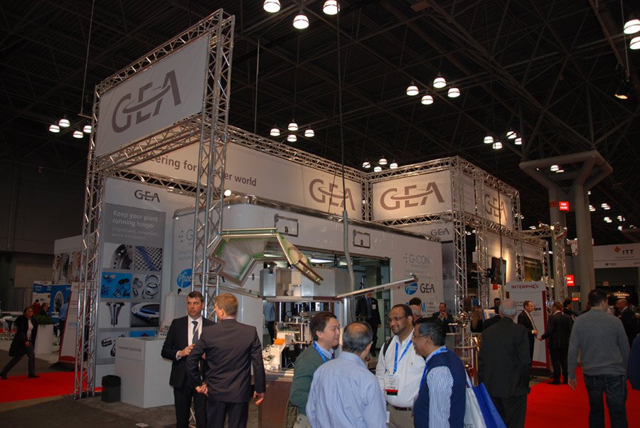
GEA Group has one of the first booths near the entrance of the tradeshow and it was massive. Large industrial scaffolding framed their walls, all wrapped around a full-sized trailer showcasing their mobile unit service offerings. Because of its sheer size, you couldn’t help but take notice.
Optima’s booth also had a large footprint with a two-story display showcasing photos of on-site personnel, supported by their service messaging below. What I thought was interesting about their booth was a secondary private room. Because tradeshows are quite hectic, having the ability to sit down with a prospective client in a quiet area seemed to be a great feature.
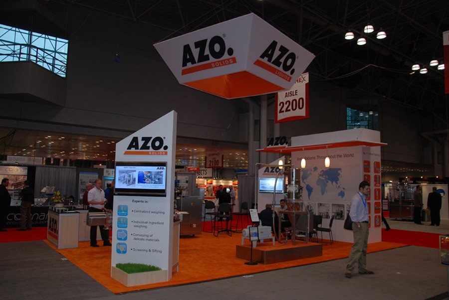
AZO really stood out to me in the sea of techie blues and grays with their bright orange footprint and signage. Having the TV stand on the edge of their area helped draw fringe wanderers, and their service messaging was very clear.

Two things really struck me about the next booth. First, the great use of illuminated colors and shapes to visually attracted an audience. Second, it was completely void of all messaging, including the company name/logo. I never did get the company name, and perhaps it’s on an area I just can’t see in the photo, but it definitely caught my attention.
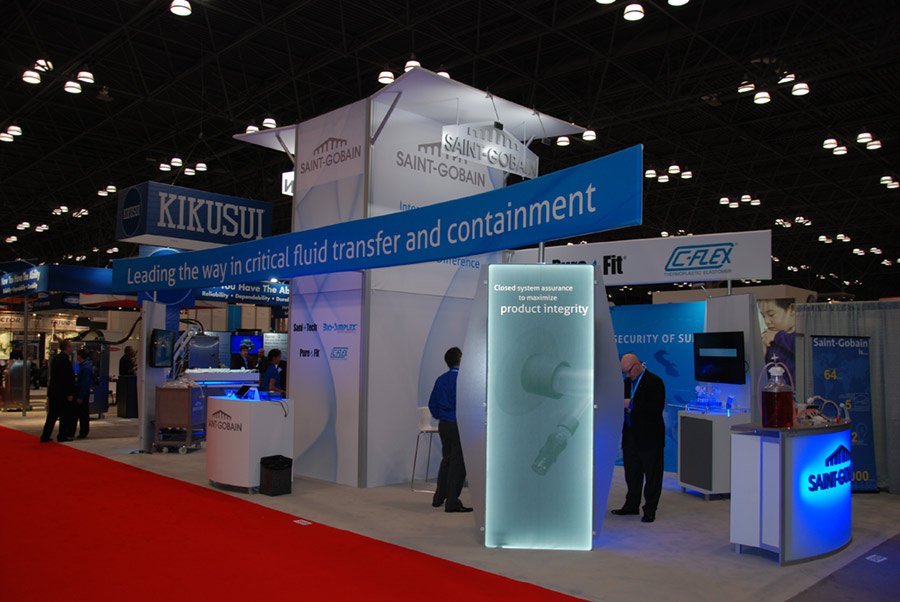
Probably the best example of showcasing a company’s mission statement, Saint-Gobain had a very nice booth design. With their service message spanning the entire length of their booth in a strong blue background, it captured your eye and brought you into examine the other great features within the booth.
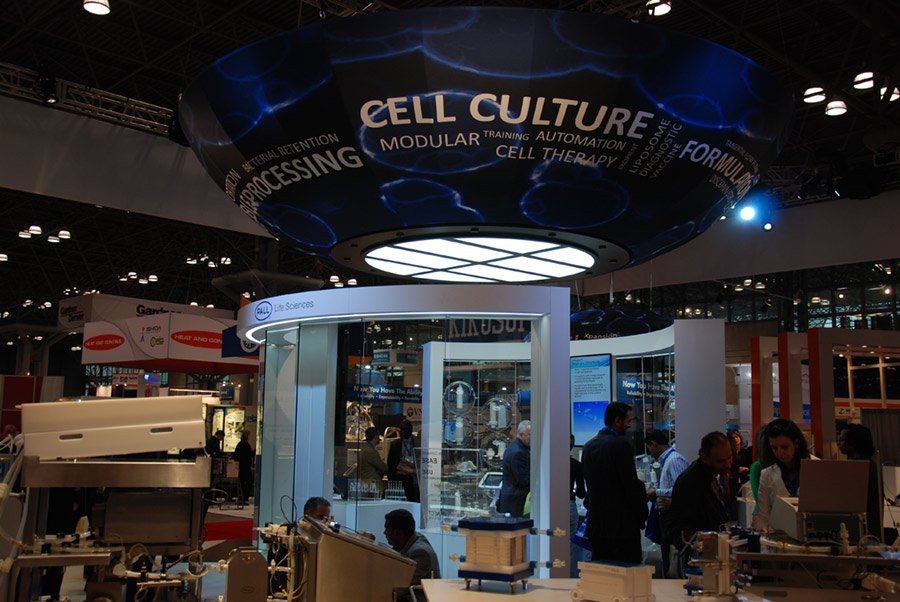
Pall Corporation’s booth was built in a circular shape with glass walls. At the core, the overhead structure clearly displayed their service offerings and provided lighting for the show-room space below.
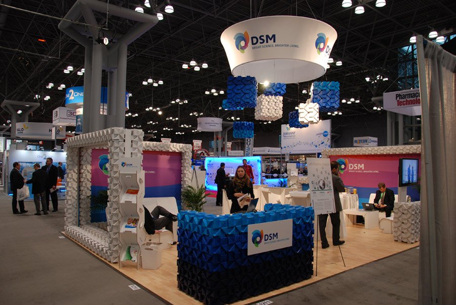
In my opinion, DSM had the most interesting booth design at the show. Their use of repeating geometric shapes gave the sense of texture. Surrounded by hard, cold, high-tech designs, it really stood out.
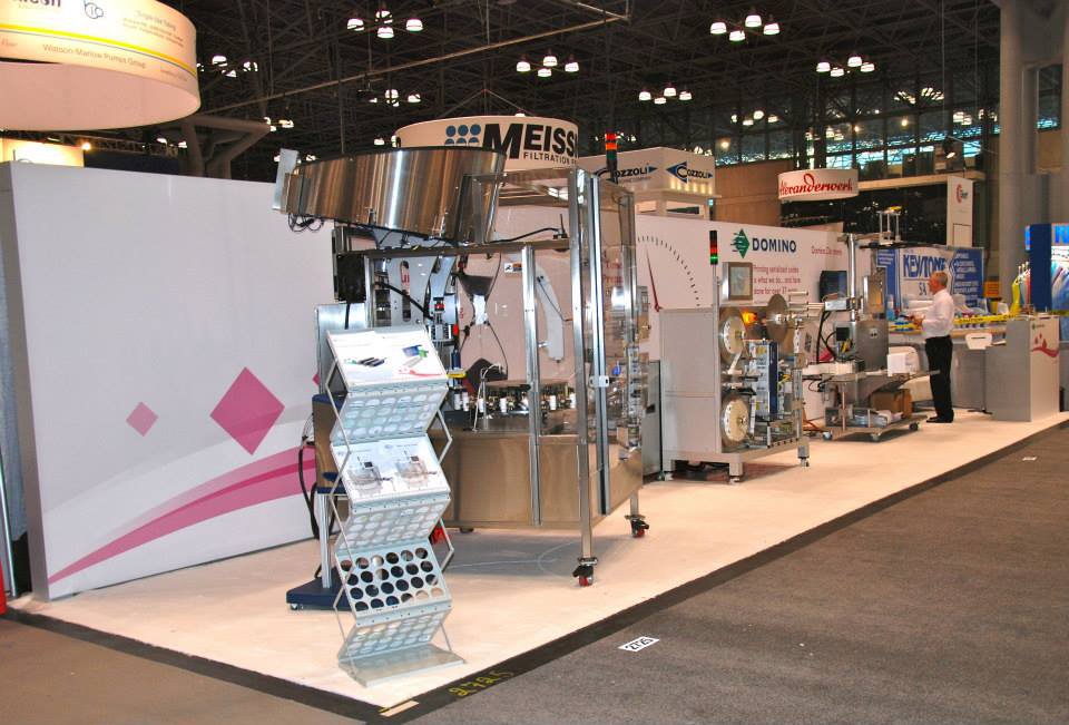
When it comes to design, some times the most admirable work shows restraint. Our client, Domino used white space to showcase what’s really important: the products. The white surrounding brought focus to their branding, product demonstration and showcasing real-world applications of their products.

In conclusion, while working at INTERPHEX 2014, I observed many different and effective booth designs – from mysterious to flashy, straightforward and some with interactive activities – all to attract visitors. Through my observations, I learned the most important thing to remember when designing a tradeshow booth is, in order to stand out and be noticed, you must do something different.
What creative tradeshow booths have you seen? What tradeshow tricks have you used to gain foot traffic to your booth?

As an interactive designer, Bart’s responsibilities include website design, development and programming along with the implementation of interactive media. A graduate of Northern Michigan University, he previously worked at Bearingpoint and as a web developer for Shopko Corporation. Bart has done significant freelance web development, taking many websites from concept to layout to programming and completion.
© Insight Creative, Inc. All rights reserved.