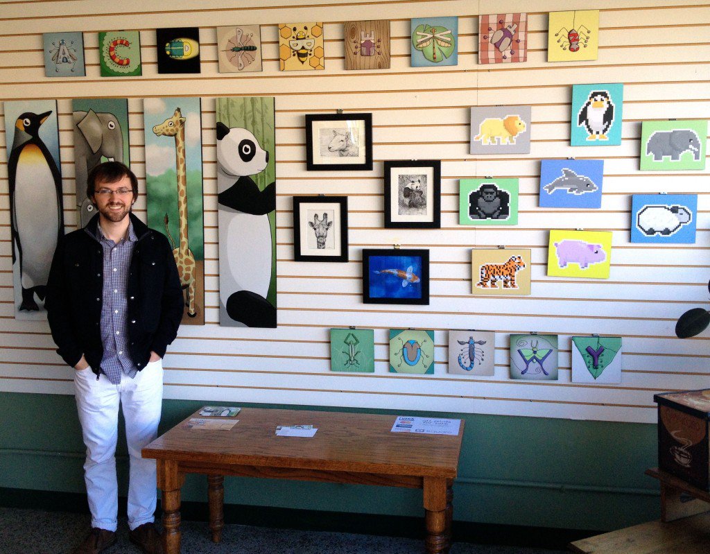
Insight Creative’s graphic designer and web developer Kevin McGillivray presented a children’s illustration and art exhibit, Tall Wild World, at The Attic in Green Bay on October 5, 2013. Hear from Kevin as he shares his technique, process and inspiration for the collection in the Q&A responses below.
Tall Wild World will be on display at The Attic through November 30th.

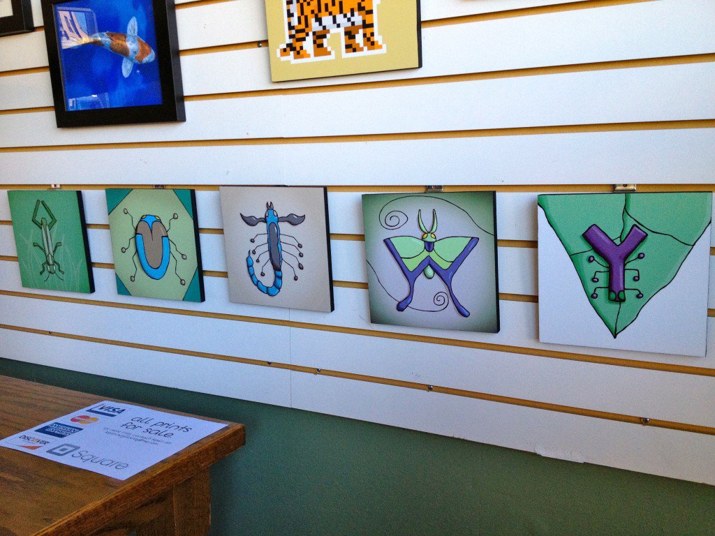
Alphabugs is a series of illustrations of the letters of the alphabet as bugs. I started each illustration by sketching the general composition of the bug in a sketchbook. To do this, I referenced pictures of real bugs and tried a few variations until I found an idea that I liked. Then I finished each piece in Photoshop using a drawing tablet.
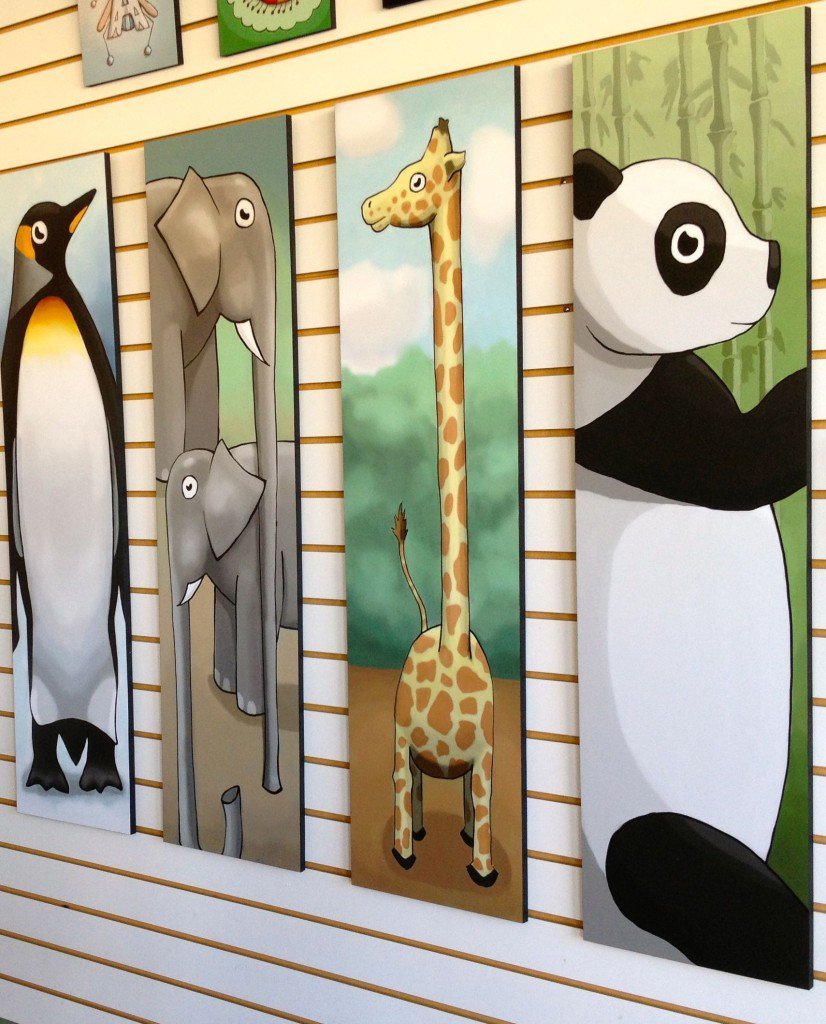
Tall Wild World is four illustrations of animals in a tall, narrow composition. Each one is three and a half feet tall. They followed pretty much the same process as the Alphabugs – lots of sketching at first and then finishing the pieces digitally.
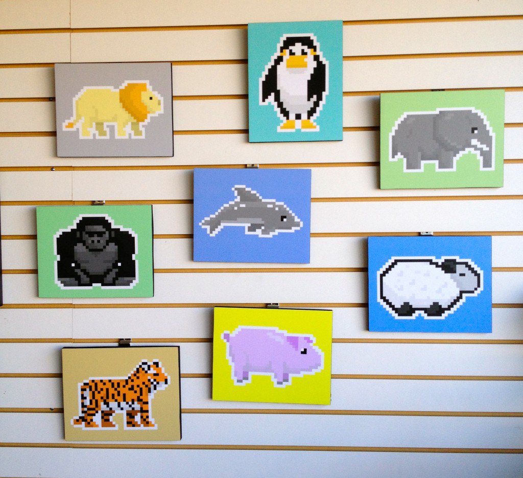
Pixel Zoo is also a series of animal illustrations, but they are made completely of large square pixels. I sketched the initial rough illustration directly into an iPad application that’s meant for creating this kind of art. By doing this, it was very similar to painting in traditional oil paints or sketching in a sketchbook, except that the medium was on a screen rather than canvas or paper. After the initial rough sketch in the application, I refined and adjusted until I ended up with the stylized pixel animals that you see in the show.

The most important thing about the technique I use is that every piece of art that I create, no matter what style or genre, follows the same two basic phases. In the first phase you move fast, loose and make a lot of mistakes. You work on the whole image at the same time rather than individual small sections one at a time. The second phase is a slower, more precise mode of working, when you fix details and mistakes. Everything goes back and forth between these two phases of experimentation and precision, no matter what specific tools or style you’re using. These two modes of working are the foundation of every creative process for any medium from writing to acting. They must be kept separate while working, and they are skills that can be practiced. Getting better at any creative medium often comes down to practicing these two opposite but complementary phases.
Kids are obsessed with tallness. I remember when I was the height of my parents’ bathroom counter and I would stand there and think, “What will it be like when I’m 20 and I can see over this counter? What will the world look like?” It’s that change of perspective that makes being taller exciting and mysterious. And it’s not just kids. Adults are the same way – obsessed with the tallness of things. Go to any city and you’ll see what a tall wild world it is. So I wanted to make the Tall Wild World illustrations the average height of a first grader, to have a conversation with them about their feelings and thoughts about tallness which are so important to them. They think about it every day.

Pixel Zoo wasn’t intended to be children’s illustration when I started it. At first I just wanted to create a sheep in pixels. But then I decided to do a children’s illustration show and when I put it in that context, it became more about kids’ curiosity about the world inside of their electronic devices. It’s very hard to see how modern technology works just from looking at it. Everything that makes it work is invisible and hidden. So when kids get a chance to see how something works on the inside they’re fascinated. I think we’re all somewhat fascinated by what goes on in our computers, about the magic of the pixel. What’s going on in there? How does it work? What does it mean? These pixel animals are a way of having a conversation with them about that, and getting their imaginations engaged with technology and what they can do with technology if they explore it.
Alphabugs was the first series of children’s illustration that I did, and the interesting thing about it is that I was really afraid of bugs as a kid. Even now they usually creep me out. Every kid knows what it’s like to feel afraid, and sometimes they don’t know what to do when they’re afraid or what would happen if they faced their fears. If you told me before I created these illustrations that I was going to draw a bunch of bugs for hours, I would have thought that was crazy and that it would be really uncomfortable for me. But creating the Alphabugs helped me change my fear into an surprising sense of curiosity and fun that I never would have expected. The illustrations are a way of listening to kids’ experiences with fear and a way to tell them a story that shows them that with a little courage and curiosity they can find something unexpectedly fun, exciting and beautiful in the places that scare them most and in the people and things that seem the most different from them.

I remember I really liked the Frog and Toad books by Arnold Lobel. As for other children’s mediums, my admiration for Mr. Rogers is even greater now than it was when I watched his show as a kid. I still watch Mr. Rogers’ Neighborhood.
My main goal was that I wanted the show to have a central theme rather than just being a random collection of pieces. I also wanted it to fit the character of the Attic and to have enough pieces to fill the wall.
I didn’t realize it when I started, but the most important end result of the exhibit was that it brought together all of the most important people to me. It’s rare for my all of my closest friends and family members to be in the same room at the same time, since usually some of them are living far away or can’t be there for some reason. Even the few people who couldn’t be there felt closely connected to the show in very supportive and encouraging ways. That experience was an example of how the energy of a show like this turns into unexpected and cool things. It feels like it has a life and energy of its own that I didn’t expect. It wasn’t a goal that I had in mind, but I quickly realized that it was the best thing about the show.
There’s a long history of designers doing children’s illustration as a side project. I think it’s a natural extension of the work I do as a designer. Illustration and design aren’t the same mediums but they are related, so doing illustration helps me understand design better and practice skills that are applicable to both illustration and design. Like I said earlier, every creative medium follows the same basic process from experimentation to precision, so every time I practice that process in one area, like illustration, I get better at doing it in other areas, like design. It’s all about practicing the creative process.
© Insight Creative, Inc. All rights reserved.